With so much emphasis being placed on maintaining a social media presence these days, it can be easy to forget what a powerful tool you have in your brand’s website. In fact, your website should be considered the focal point of your marketing efforts.
While your social media accounts are important for stimulating customer engagement and promoting brand awareness, your website is where potential customers will go to learn more about your products and services, as well as your company’s overarching philosophy and vision.
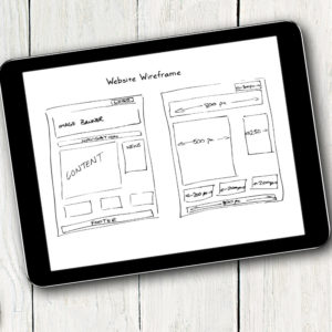
In this day and age, it can be tough to keep up with constantly changing digital trends. Even if you feel like you just did a website revamp, the truth is that your site can easily feel clunky and outdated if you’re not consistently staying on top of the latest improvements and innovations in coding and design.
Fortunately, you don’t have to be an IT wiz to ensure that your site feels fresh and provides your customers with the information they’re looking for. All you have to do is remain aware of important changes and little tweaks you can make to keep the purchase journey swift and frictionless.
Improve Your Website with These Tips
When it comes to rethinking the design and user experience of your website, start with the basics. Here are our tips for boosting user experience on your site and ensuring that you’re not overlooking important details that could be causing friction or impeding conversions.
Stick to Proven Conventions
You don’t have to reinvent the wheel when it comes to website design. In fact, doing something new and experimental could even hurt user experience. Time-tested conventions work for a reason: people are familiar with them!
For example, users will naturally gravitate to the top right-hand corner when looking for the main navigation menu and phone number, so why not go ahead and place them there? Likewise, it’s relatively common for social media links, sign-up forms, and location information to appear in the footer. If important details such as these are hard to find, users will likely become frustrated and jump off your site, often leading them to your competitors.
Make Clickable Links Obvious
If you’re including a link somewhere on your site, it’s because you want users to take action. However, all too often brands fail to make it obvious that their links and buttons are clickable, creating an obstacle for the user that could easily be avoided.
There are plenty of cues you can provide to make users aware of clickable content. Most people recognize links through font formatting—usually color and underlining. Buttons, on the other hand, should have a shadow that increases on both hover and click.
Most importantly, stay consistent sitewide with your link and button formatting. The last thing you want to do is confuse users about how to access information by making clickable material hard to recognize.
Embrace White Space
You may feel that your website is a piece of real estate that should be filled to the brim with information about your company and its services. After all, you’re paying to have this little section of the Internet devoted to your brand! However, white space has value too. In fact, it’s a critical component of good design and a positive user experience.
If you’ve ever landed on a website cluttered with words and pictures, you know how frustrating it can be to navigate a page with too little white space. Nonetheless, it can be tough to acknowledge this reality when your main goal is to give your customers enough information to drive a conversion.
Think of your website more as virtual office space for your brand, rather than an encyclopedia. Just as you’d want your office to appear tidy and organized to potential customers, it’s even more important for your website to give users plenty of space to focus their attention and digest the information you’re presenting.
Prioritize Consistency
A lack of consistency from page to page on your site isn’t just an aesthetic issue—it can actually be a trust issue for wary users. When heading sizes, font types, coloring, and spacing changes from page to page, users may become concerned that they’ve clicked through to another site. This leads them to mistrust the information they’re reading and lower the value that they place on the products and services they find on your site.
Prevent confusion and missed opportunities for conversion by ensuring the site design retains a consistent theme throughout all pages. From your home page to individual product pages to testimonials, a consistent theme should be the through-line connecting the different elements of your site together.